Celebrating two decades of partnership, community, and progress.


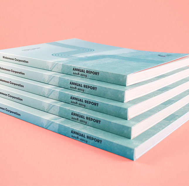
Working closely with Cree land users and other beneficiaries, Niskamoon Corporation develops and oversees projects that help alleviate the impacts of hydroelectric development in northern Québec. For over 20 years, their work has supported Cree communities and traditional ways of life while fostering partnerships that bridge past and future.
The 2024–2025 year marked Niskamoon’s 20th anniversary. This milestone annual report called for a design rooted in continuity and connection. It also marks a decade of our work together on projects like this.

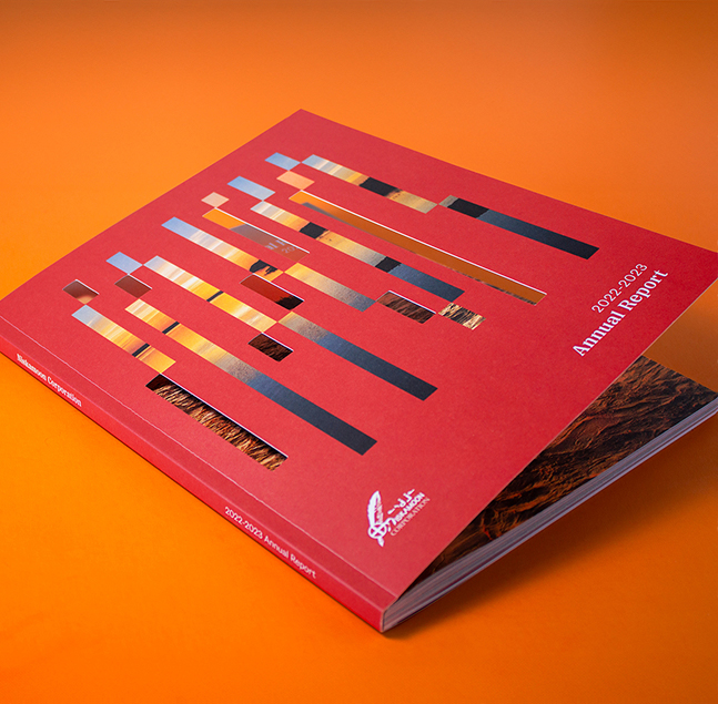
The concept centers on moving forward while honouring the past. A flowing ribbon motif (an element carried over from their logo), weaves throughout the report, symbolizing the connection between land, community, and progress over time. Each section builds on the next, reflecting how past achievements shape future progress.


The report is organized into three sections, each anchored by Niskamoon’s red and blue brand colours. Pops of yellow were introduced to celebrate the 20 year milestone and signal optimism for the future. Vertical pagination runs along the edge for ease of usability.
The result is a report that feels grounded, purposeful, and celebratory, marking two decades of impact while looking confidently toward the future.


Client
Niskamoon Corporation
industry
Government
project
Hungry for more?
Check out these related projects.
We make it our business to make yours look good.
Have a project in mind? Don’t be shy, say hi.
Never miss a piece of the action. Subscribe for your quarterly sugar rush.
Thoughtful design for brands with heart.