Rebranding a pharmaceutical leader advancing dry eye solutions for humans and animals.
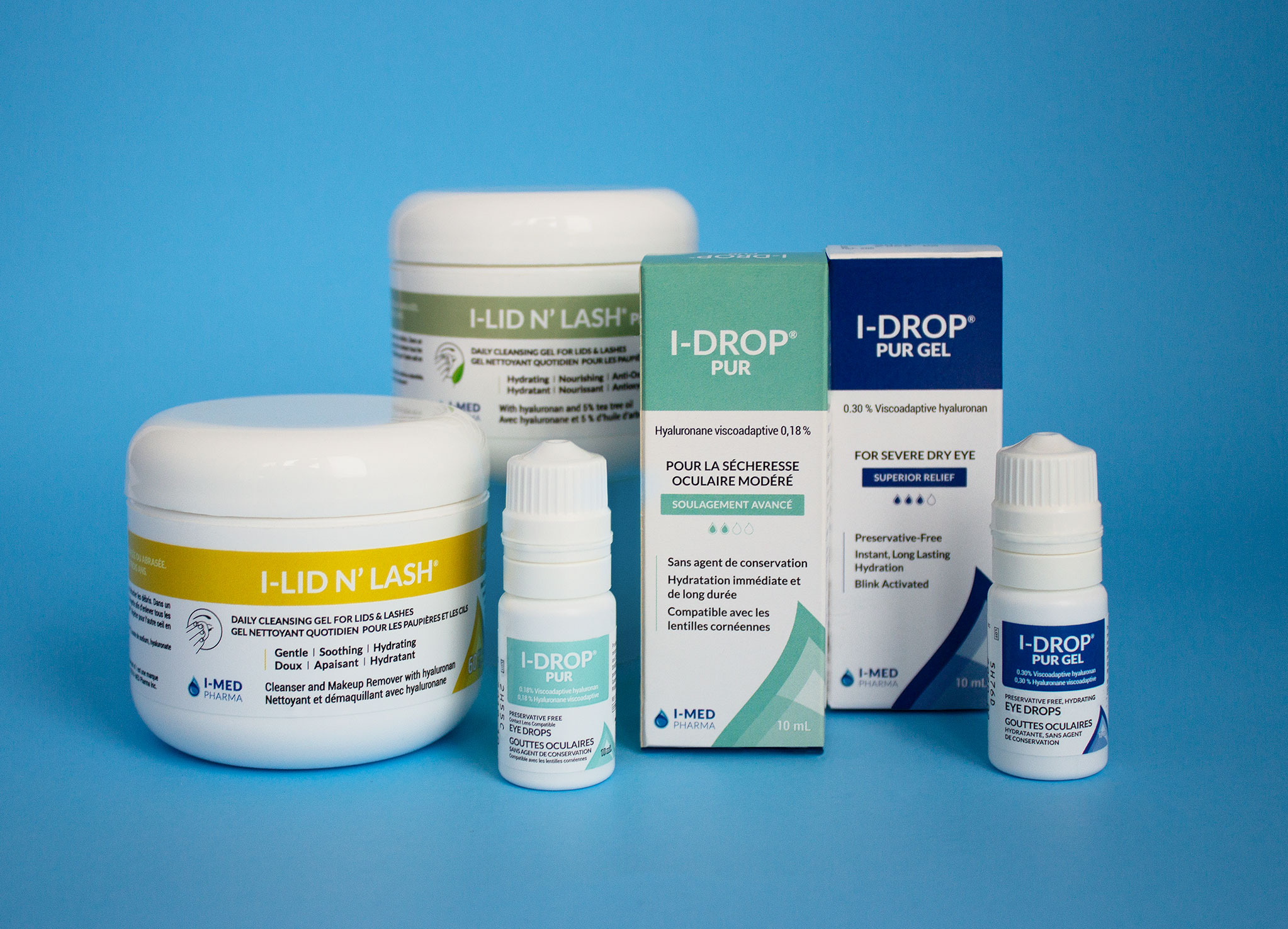
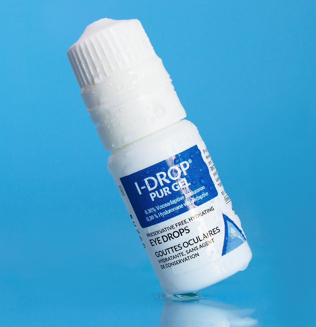
Specializing in dry eye diagnosis and management, I-MED Pharma offers a complete range of diagnostic tools and treatment solutions with the mission of providing complete relief to dry eye and ocular surface disease patients worldwide.
While I-MED Pharma has been around since the 1980s, when they came to us, brand awareness was lacking. We initially identified three major design pain points:
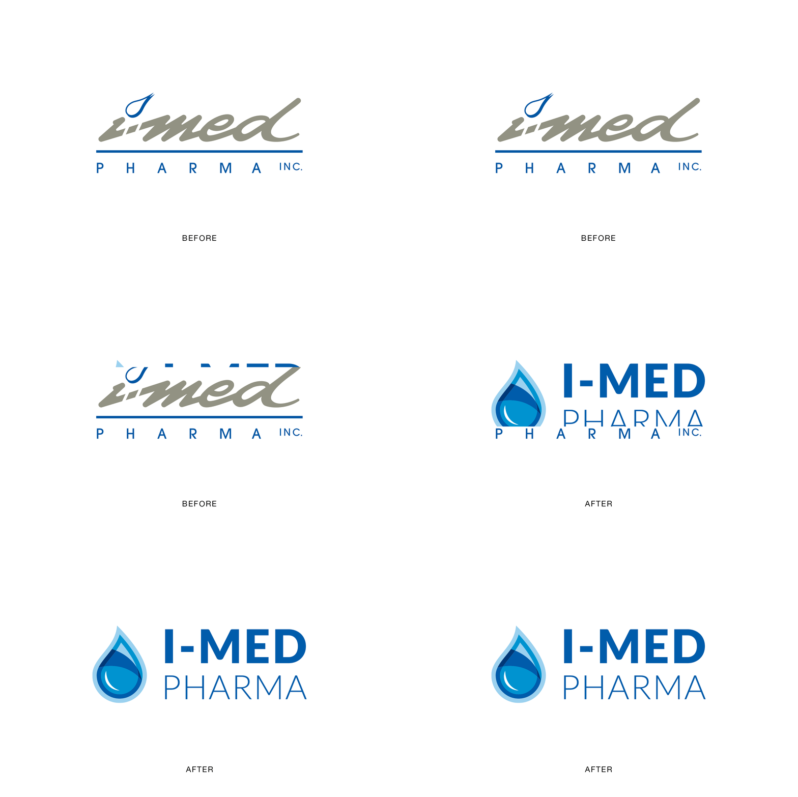
- Their logo was difficult to read, lacked flexibility, and encountered legibility issues when used in small sizes.
- The brand as a whole lacked cohesion across product SKUs.
- Their packaging did not convey trust to consumers. For a brand that operates in the eye care field, where competition is high and consumer trust is essential, we understood the urgency of the visual changes needed to help this brand succeed.
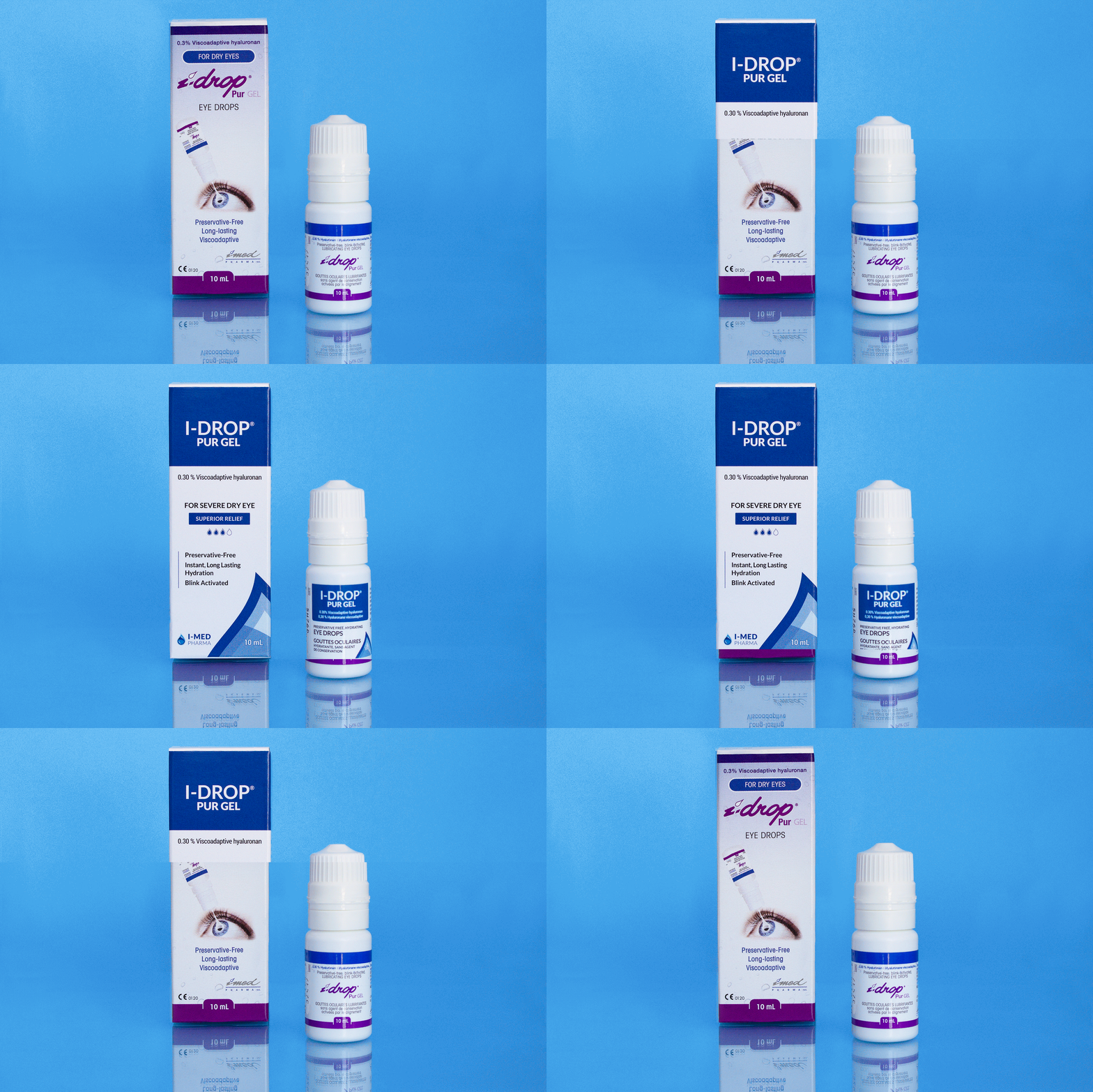
In making the brand more contemporary, we were able to help them stand out amongst competitors, solve the issue surrounding conveying trust, and attract new customers.
Our first task was to update the logo while maintaining the spirit of the original design. The refreshed logo retains core elements from the original design while significantly increasing its legibility and adaptiveness.
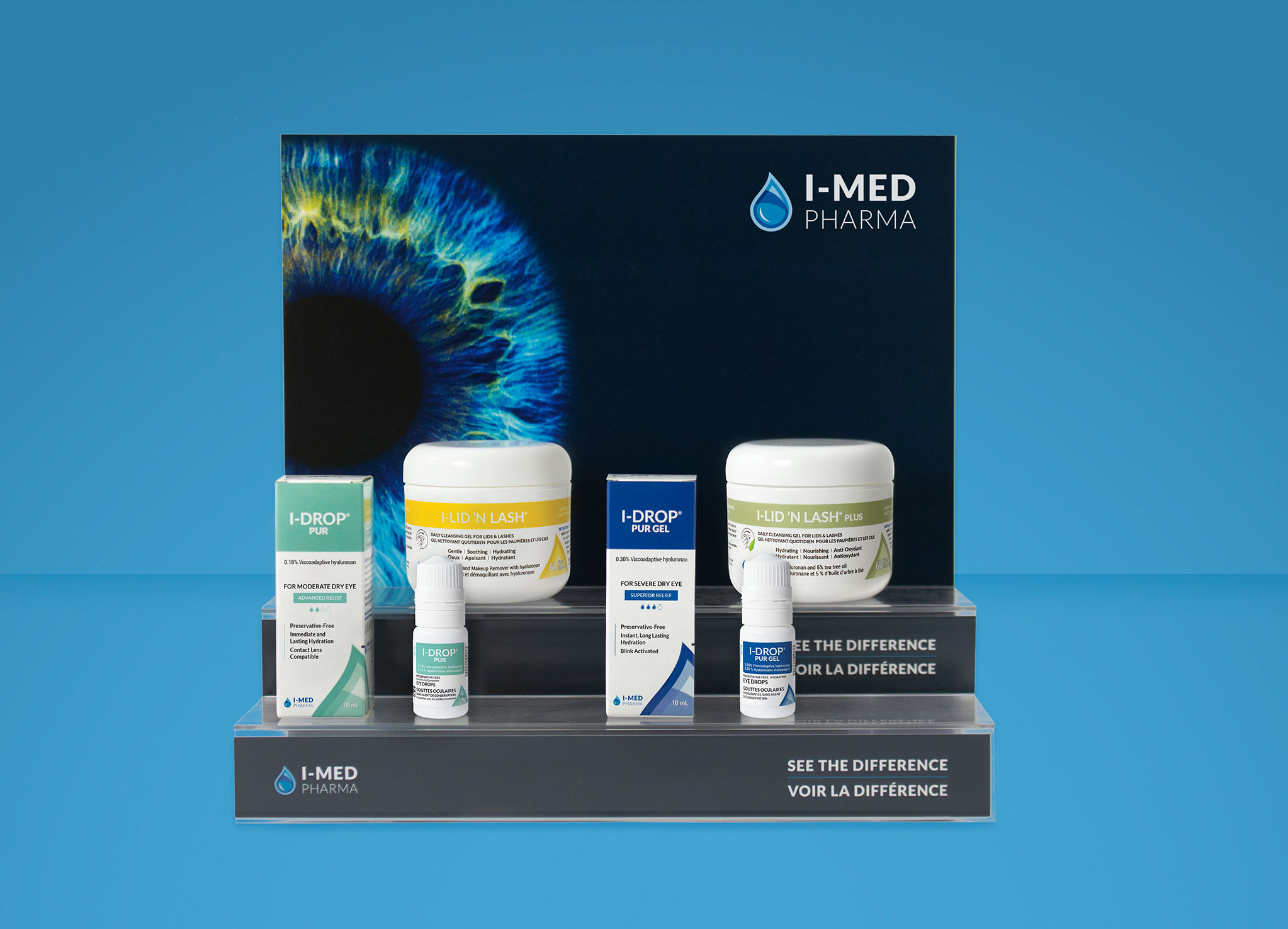
After the logo refresh was complete, we worked on flexible brand identity materials for both on and offline application. Finally, we tackled redesigning their suite of product packaging, including using more clear and concise language.
The rebrand allowed I-MED to expand their reach by selling in the American market and opening a European warehouse with less friction. The increase in sales that came from this expansion has allowed them the funds required to research and develop new products. In a few short years, I-MED Pharma exploded from a local distributor to a global brand with their products on shelves in over 30 countries!
We retained the integrity of this 2nd generation company while delivering forward-thinking solutions. We supplied them with brand materials that could be easily applied in a variety of circumstances, from shelf displays to tradeshows and everything in between. I-MED Pharma products are now available through eye care professionals in hundreds of clinics and locations worldwide and our packaging designs have been translated into more than 6 languages.
Client
I-MED Pharma Inc.
industry
Healthcare
project
Hungry for more?
Check out these related projects.
We make it our business to make yours look good.
Have a project in mind? Don’t be shy, say hi.
Never miss a piece of the action. Subscribe for your quarterly sugar rush.
Thoughtful design for brands with heart.
