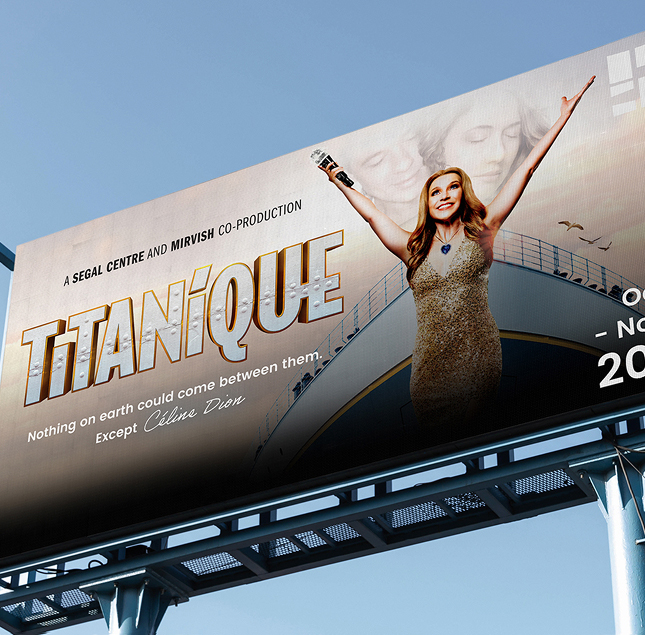
The beating heart of English theatre in Montreal where every performance at the Segal Centre brings all the feels.


For more than 6 years we have been creating standing-ovation-worthy graphics for the Segal Centre. Our vibrant designs are used in marketing campaigns year-round to attract viewers of all ages to experience transformative productions at the Segal.
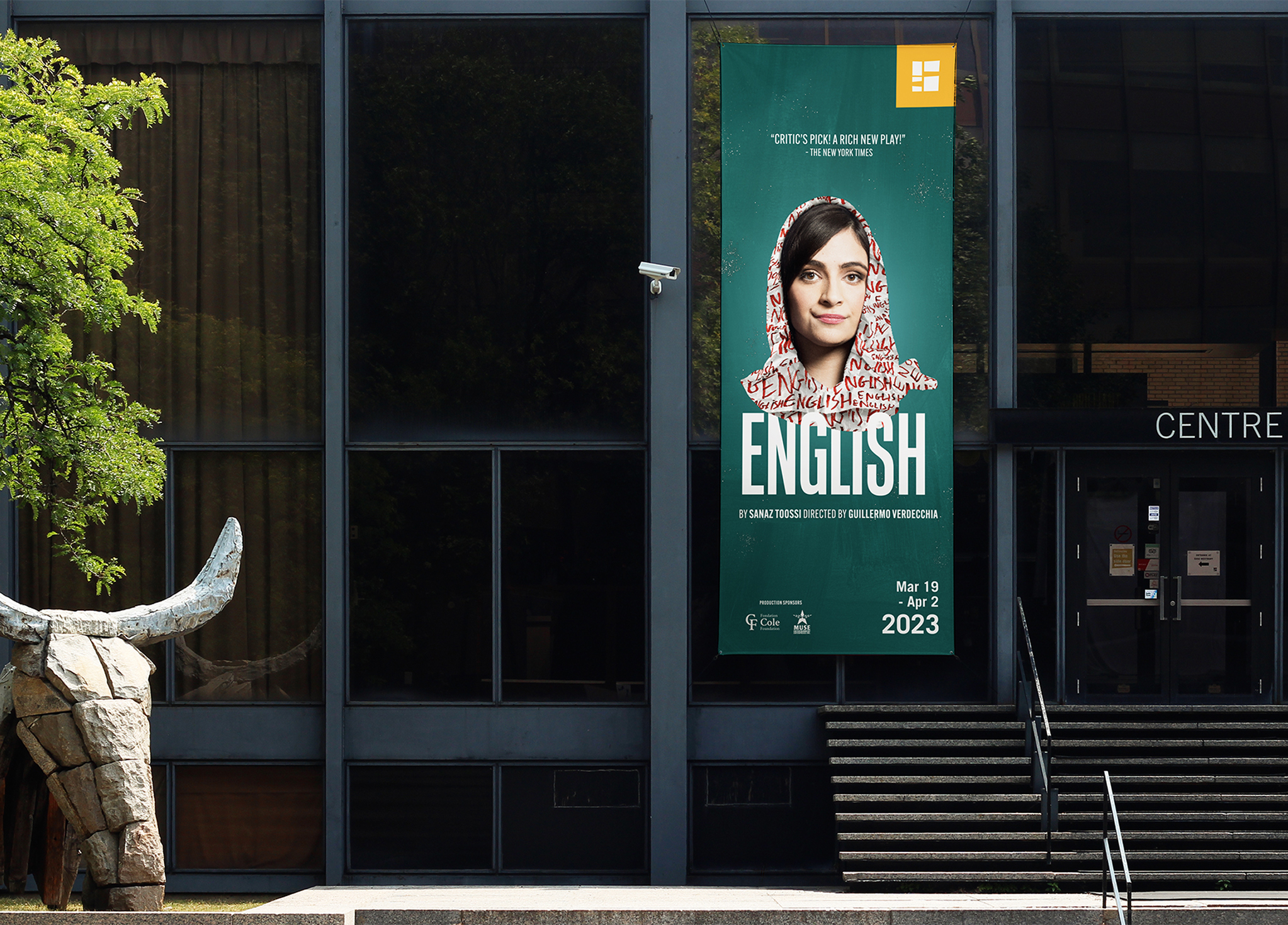
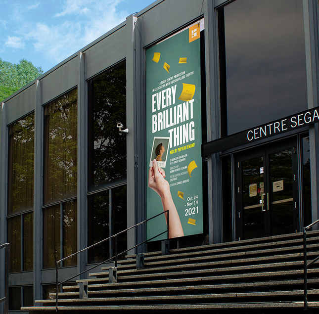
This year’s tagline was ‘All the Feels’ highlighting the emotionality of each production. From comedy to drama, each play this season was sure to bring the feeling, and each poster needed to represent that.

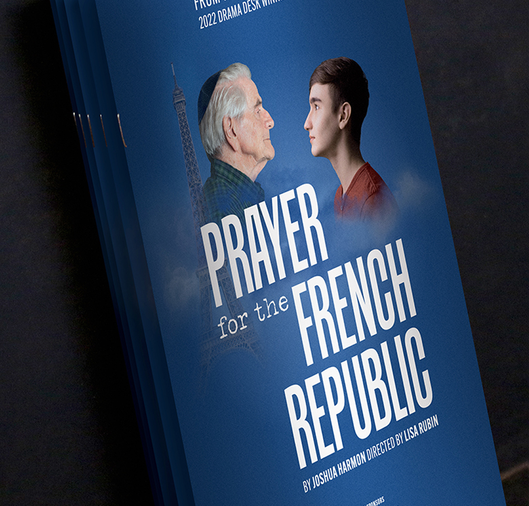
The 2022-2023 season was filled with successes that had audiences laughing, crying, and celebrating. Dracula, A Comedy of Terrors is headed to Off-Broadway in NYC with James Daly and our artwork before landing in London, Sanaz Toossi wins the Pulitzer Prize for English; and Prayer for the French Republic to hit Broadway, and Josephine: A Musical Cabaret closed the season with sold-out runs.

At the end of the season, the Segal Centre was nominated for the Tourisme Montréal “Choix du public” award at their Prix Distinction 2023.

Client
Segal Centre
industry
Arts & Culture
project
Hungry for more?
Check out these related projects.
We make it our business to make yours look good.
Have a project in mind? Don’t be shy, say hi.
Never miss a piece of the action. Subscribe for your quarterly sugar rush.
Thoughtful design for brands with heart.