With over 65,000 visitors a year, the Segal Centre for Performing Arts is a choice destination amongst Montreal theatre goers.

For the past 10 years, our team has been creating standing-ovation-worthy campaign and production graphics at this premiere English-language theatre. Our eye-catching graphics anchor year-round marketing campaigns drawing audiences of all ages to experience the transformative power of the Segal Centre's world-class live theatre.
Each production graphic is designed to stand-alone while also working together as part of a cohesive season. For 2025–26, our bold, retro-inspired designs are framed in geometric shapes and set in a rich, 70s-inspired jewel-toned palette to give nostalgic flair with a fresh, modern twist.
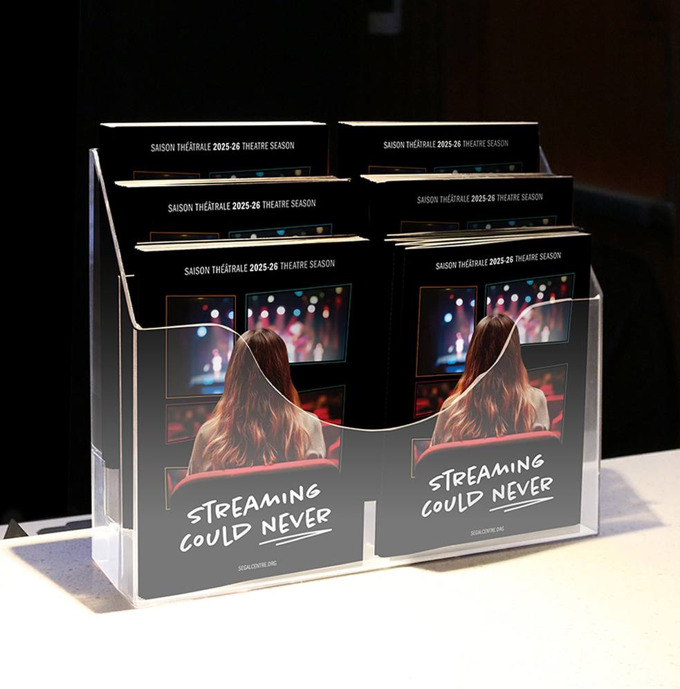
The Streaming Could Never season campaign graphic features a young woman in the audience captivated by the vibrant energy of a live performance, framed within the Segal’s signature logo "S" symbol. The design speaks to the magic of sharing a performance in real time, surrounded by people experiencing the same thing at the same time— something streaming just can’t replicate. It’s a celebration of connection and of theatre at its most alive.

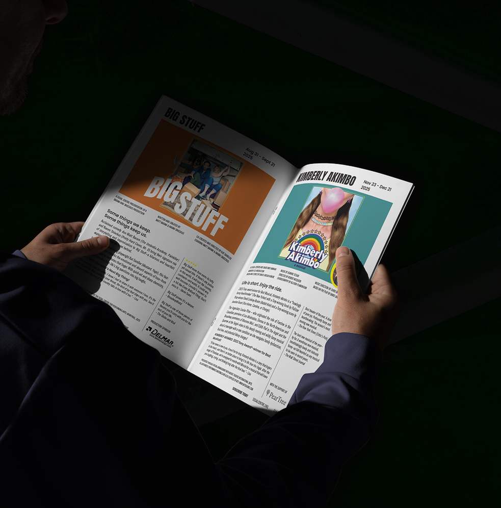
Our graphic for Big Stuff captures the heart and humour of life’s messy moments. Set against a warm orange backdrop, acclaimed comedy duo Matt Baram and Naomi Snieckus are pictured on the back of a moving truck as boxes spill out around them. The visual bursts with energy and sets the tone for this fast-paced, heartfelt, and hilarious story of memory and the emotional baggage that's left behind after loss.

For Tony Award-winning musical Kimberly Akimbo, our graphic was inspired by the show’s offbeat charm. Featuring the lower half of a mature woman’s face blowing a bright pink bubble, the design hints at the show’s unique premise: a teenager in a body that’s aging far too quickly. With 90s throwback touches like a candy necklace, tattoo choker, sparkly star earrings, and set on a cheesy school photo backdrop, the visual oozes nostalgic fun. The frame keeps the composition tight allowing the bubble to break the border echoing how Kimberly defies convention and expectations.

For Playing Shylock, we wanted our graphic to capture the duality at the heart of this powerful work. Canadian icon Saul Rubinek is mirrored reflecting the complex tensions between character and self, performance and identity. The frame around him splits down the middle, emphasizing the divide between art and accountability. Set against a deep ruby red backdrop, the design nods to the richness of Shakespearean theatre and draws us into a performance that promises to provoke and challenge.

Detroit: Music for Motor City captures the unstoppable rhythm of a city that redefined sound across generations. The dancer steps through time and across musical genres— going from a Motown shimmer, to disco-era metallics, and then to the grounded energy of hip-hop. Set against an energetic yellow, he bursts through the frame setting the stage for a show that promises to entertain.

For the Segal Centre’s production of Grow, we created a bold, high-energy poster that captures the show’s offbeat charm and ambition. Two Amish sisters, one brimming with excitement, the other reluctantly along for the ride, are set against a vibrant green backdrop with a sprawling marijuana field and a dreamlike city beyond. The composition is contained in the shape of a flower pot and balances humour and heart, evoking the thrill of chasing your dreams, no matter how unconventional they may seem.

A show like Di Shvegerins (Les Belles-Sœurs) is full of attitude and unexpected joy and our graphic for this iconic musical had to match. Confetti rains down over a woman mid-gossip as a playful nod to the coveted stamps that drive the story's hilarity and heartache. Framed within a scalloped stamp shape, she pops in front of the turquoise background. The design is cheeky just like the main character Germaine Lauzon and her unforgettable circle of sisters.
The season brochure we designed brings the entire season together. The bilingual programming offers an exciting look at the upcoming productions alongside promoting membership benefits and highlighting subscriber perks to drive sales. The brochure is a front-row ticket to everything Segal.
Client
Segal Centre
industry
Arts & Culture
project
Hungry for more?
Check out these related projects.
We make it our business to make yours look good.
Have a project in mind? Don’t be shy, say hi.
Never miss a piece of the action. Subscribe for your quarterly sugar rush.
Thoughtful design for brands with heart.