Direct mail that serves up a noteworthy experience, every time.
During the holiday season, we love to send our clients something a little different– a self-promo pieces that go beyond the usual greeting card. Our goal is simple: to surprise, delight, and leave an impression that lasts long after the seasonal decorations are packed away. From playful concepts to thoughtful keepsakes, our holiday cards are a chance to showcase our creativity while sharing joy with the people we’re grateful to work with.
2025
Sixteen years. That calls for cake!
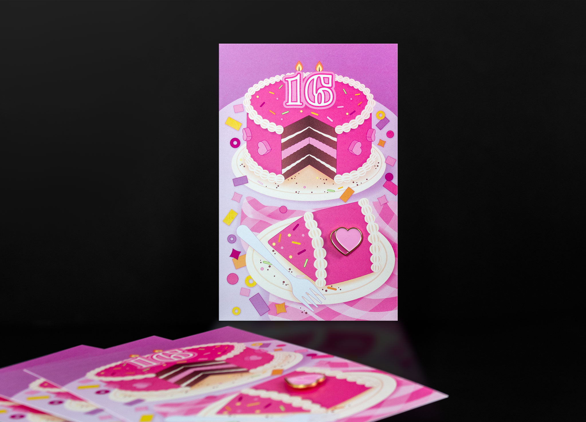
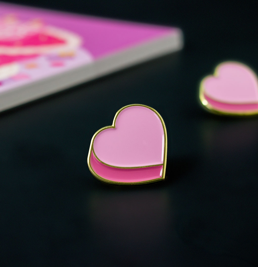
Our 2025 holiday card helped mark our studio’s 16th year, so we decided to share a slice with the people who made it possible. Our cake illustration was topped with a pink candy heart enamel pin to share a little love and appreciation.
2024
Great ideas don't stand still.
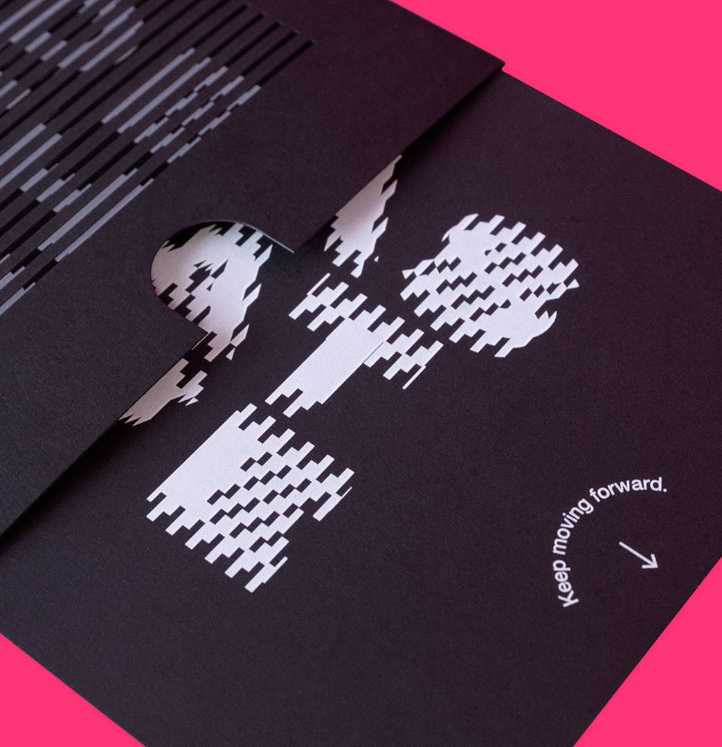
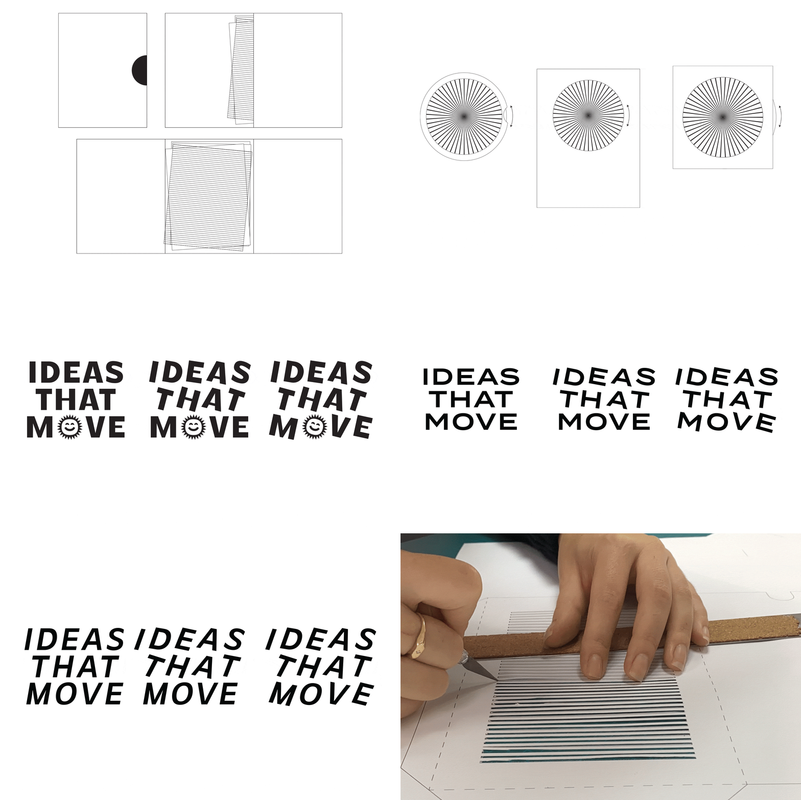
A moving card? Yup! This interactive scanimation brings the text to life as you pull the tab, a playful nod to the creative process, where ideas don’t stay still—they evolve, adapt, and make a difference.
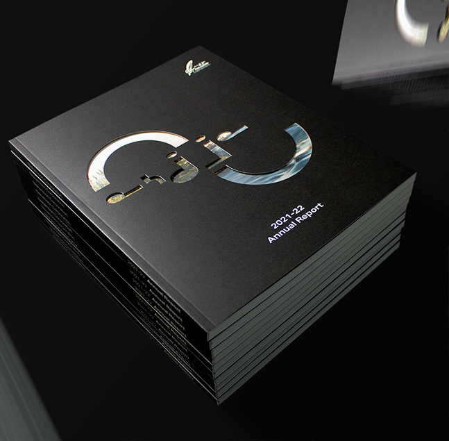
Printed on luxe black paper with precision laser-cut details, the card is more than a greeting—it’s a celebration of the creativity that drives us forward.
2023
Take a peek behind the curtain at our creative process.
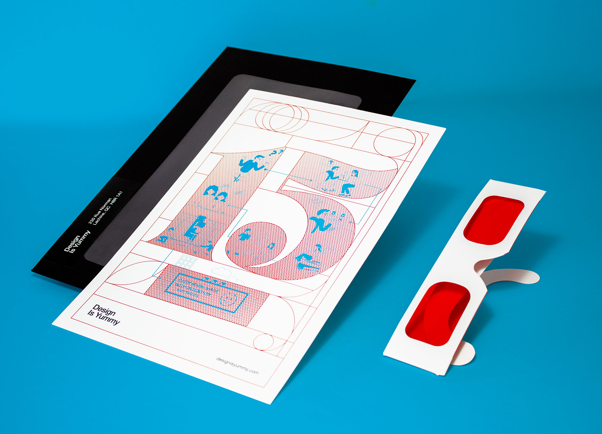
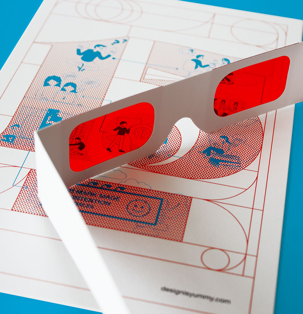
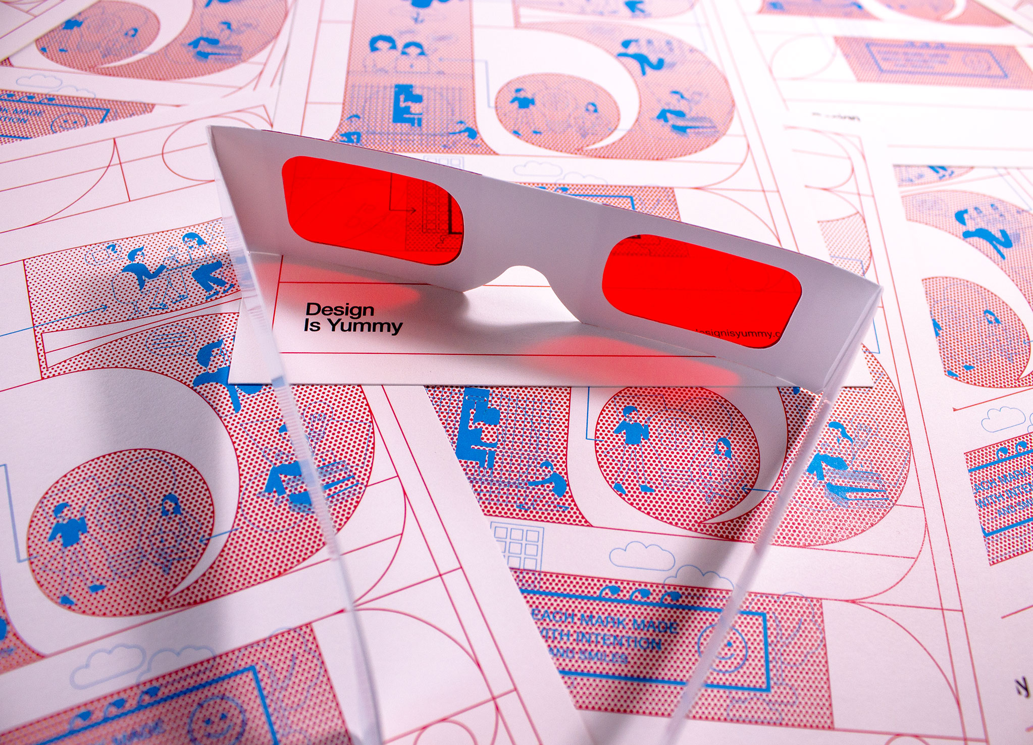
To mark our 15-year anniversary, we invited recipients to peek behind the curtain and see how creativity turns challenges into opportunities.
We followed up with a playful campaign, letting recipients create their own hidden-message artwork, revealed through the included glasses.
2022
Nostalgic design adds playfulness.
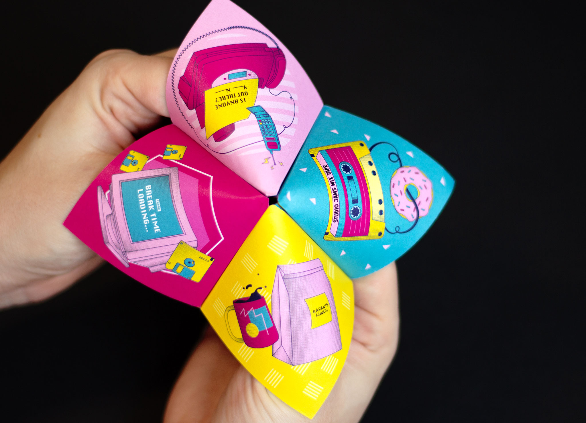
After a post-pandemic year of twists and turns, this holiday campaign was aimed at bringing play back into our clients’ lives.
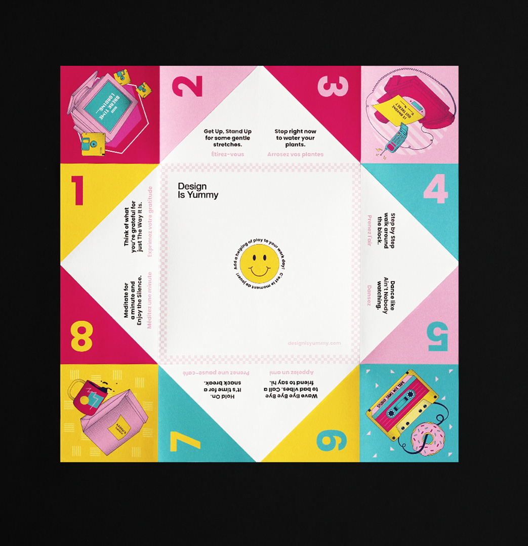
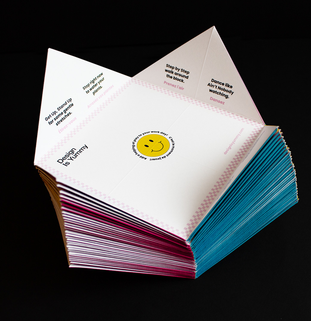
Whether back at the office or working from the living room, we could all use a break to do the time warp again back to simpler years. This custom cootie catcher is chock full of colourful illustrations, nostalgic patterns, and provides ideas on how to take that much-needed pause.
We make a lot of decisions each day, but with this cootie catcher, how to take a break isn’t one of them. With an attention-grabbing colour palette and illustrations of gone (but not forgotten) office technology from the 80s and 90s, the card combines work and play in a fresh way. With prompts ranging from: ‘Dance like Ain’t Nobody watching’ to ‘Hold On. It’s time for a snack break’ the cootie catcher encourages you to have fun, embrace randomness, and remember how it felt to be a kid again. Music lovers note that the break prompts each contain an oldie song title (which hints at another layer to the piece).
Curious recipients who unfold the cootie catcher discover a hidden QR code on the back with a little surprise— a link to our retro throwback playlist.
2021
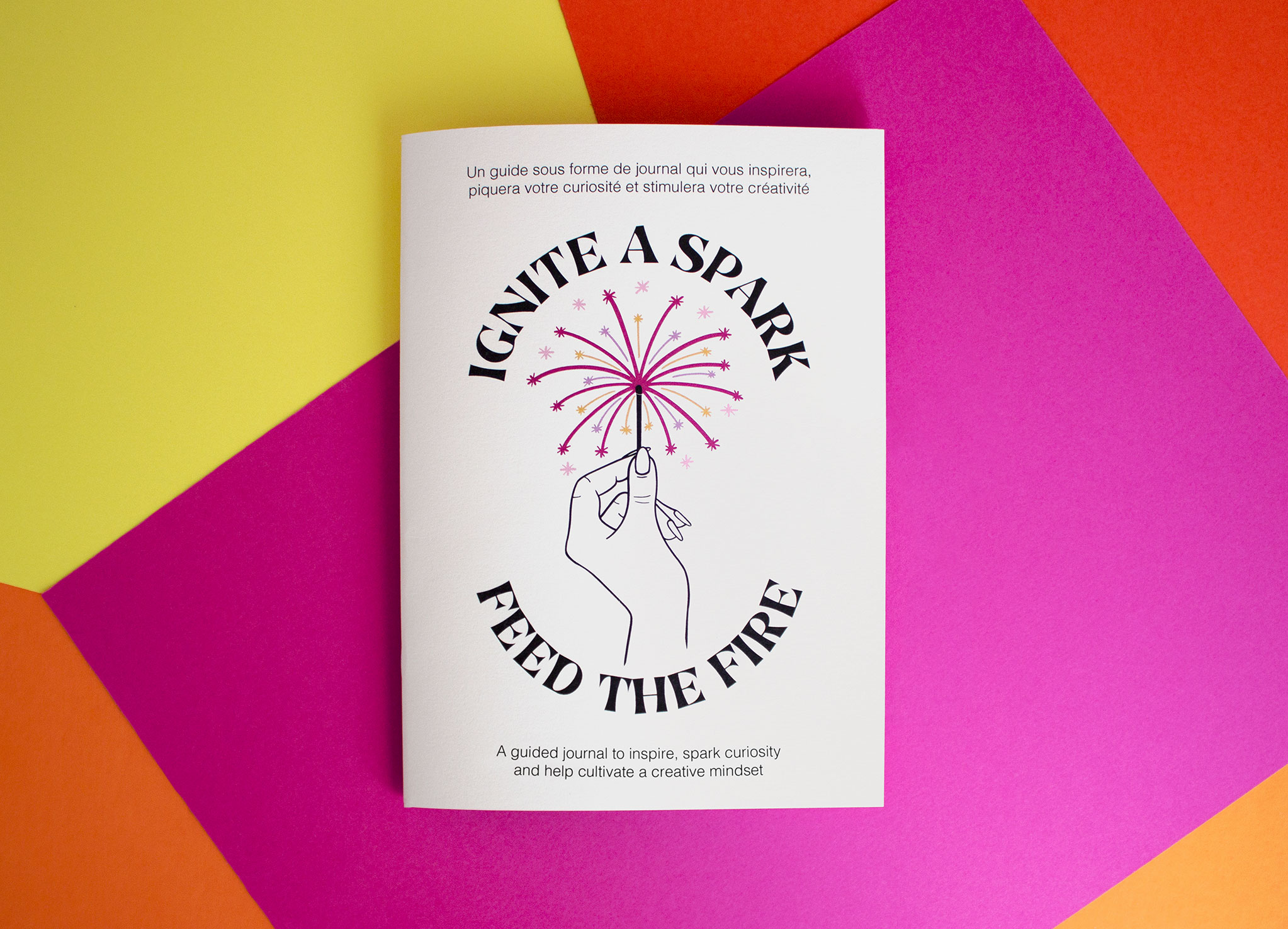
A guided journal to inspire, spark curiosity, and cultivate a creative mindset.
After another rollercoaster pandemic year, we wanted to gift our clients and supporters something special.
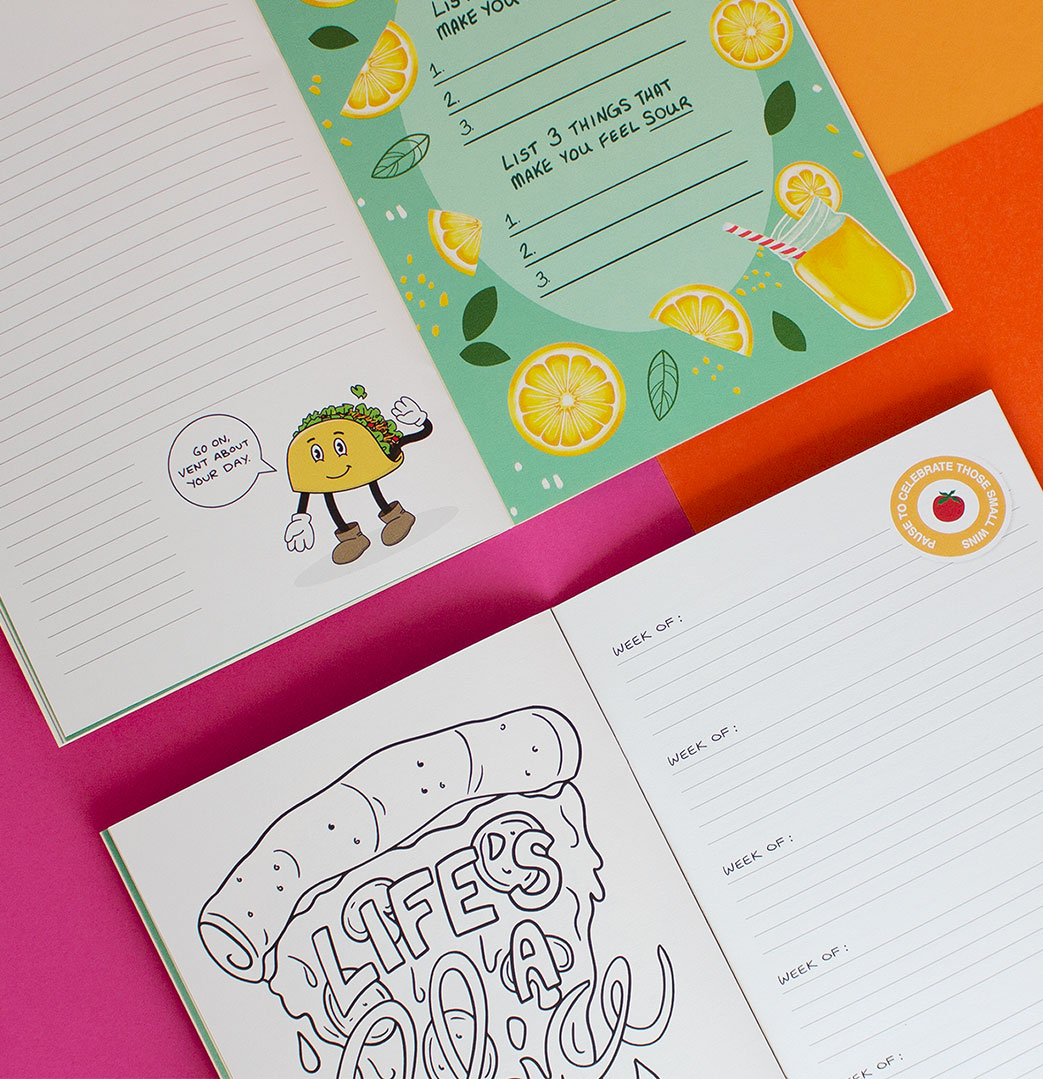
Our 2021 holiday card took the form of a guided journal, full of colourful custom illustrations, writing prompts, and delicious puns to help recipients be inspired throughout the coming year.
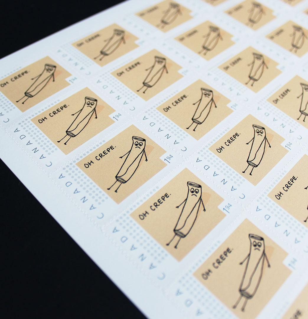
This project allowed our team to flex our creative muscles and discover joy in the process, something that had become more difficult during the pandemic with the team continuing to work remotely. Our custom ‘Oh Crepe’ stamp poked fun at the current pandemic mood (humour is healing, right?).
As the card was released, many of us entered another holiday lockdown. It turned out to be the perfect reminder to find joy in the little things, look after ourselves, be kind, and celebrate all the small wins.
2020
2020 was an absolute sh*t show, but we're all in this together.
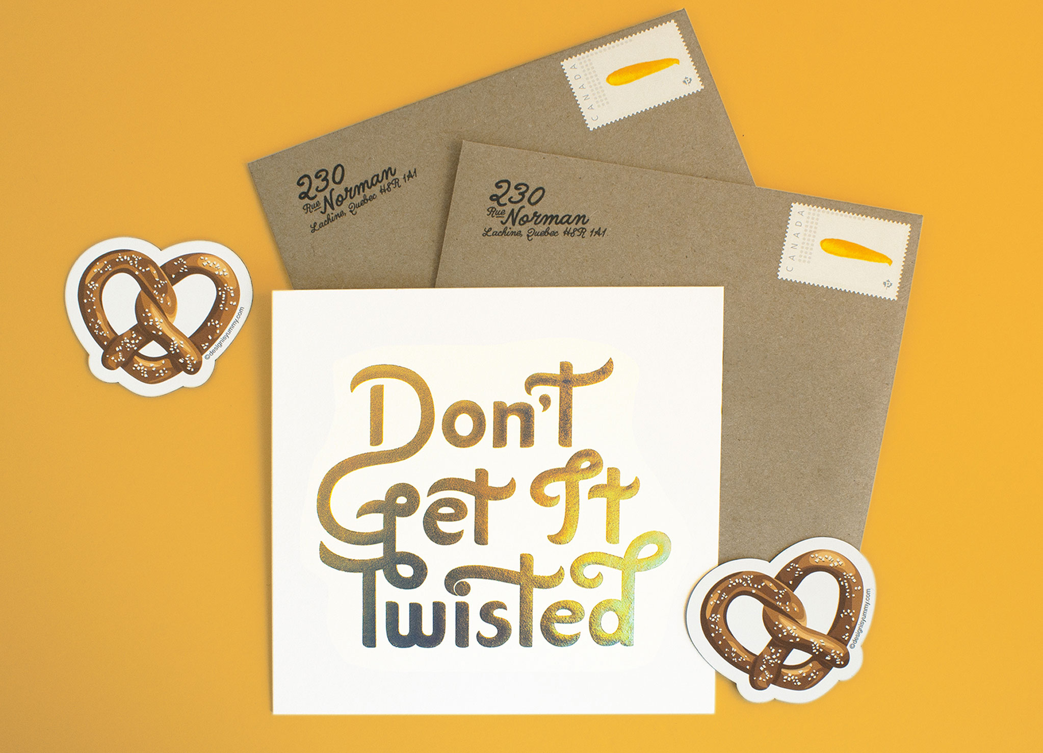
Our 2020 holiday card didn’t shy away from talking about the how challenging the pandemic year was. We also wanted to let our friends and supporters know that through it all, we’re in this together.
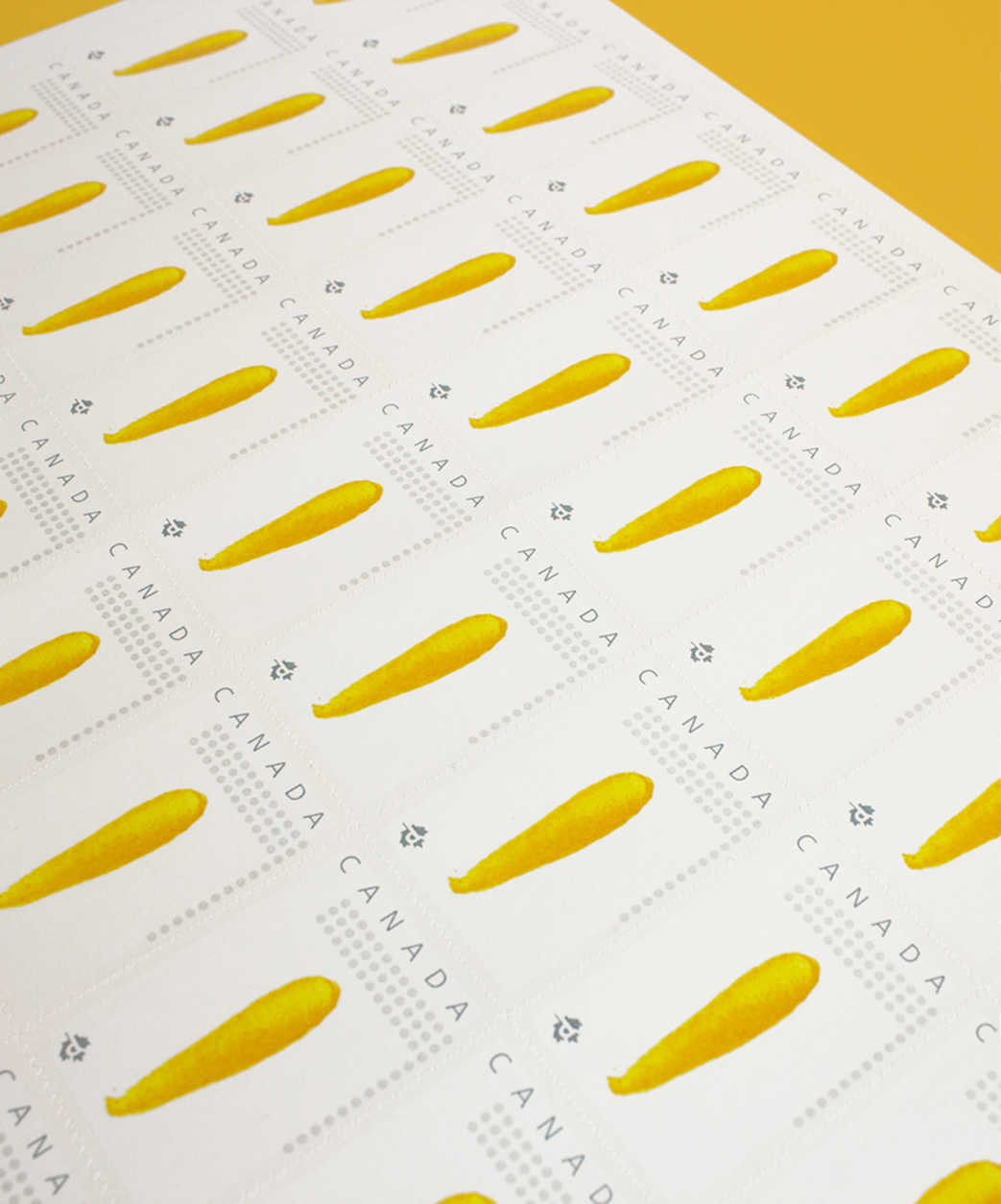
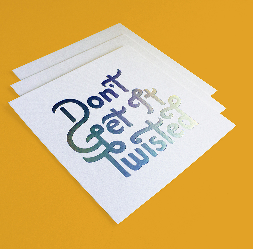
Lucky supporters received a beautiful hand-lettered card with subtle rainbow foil stamped message (referencing the ‘ça va bien aller’ campaign). This card was intentionally designed flat so it could be used as wall art (in a time when we were all staring at the same 4 walls). Included with the card was a custom-illustrated heart-shaped pretzel magnet – a reminder that no matter how salty things might get, showing continued kindness to ourselves and those around us keeps life sweet. The piece was completed with a custom mustard postage stamp.
This card was a feat of collaboration. With our crew all working remotely, it presented an opportunity to show how well we work as a team. The different elements of the card were assembled and hand lettered in different locations with pieces going back and forth between us to make it all come together.
We know our clients and friends loved receiving these special messages of hope and kindness during the most challenging of days.
2019
Celebrating 10 years with a splash.
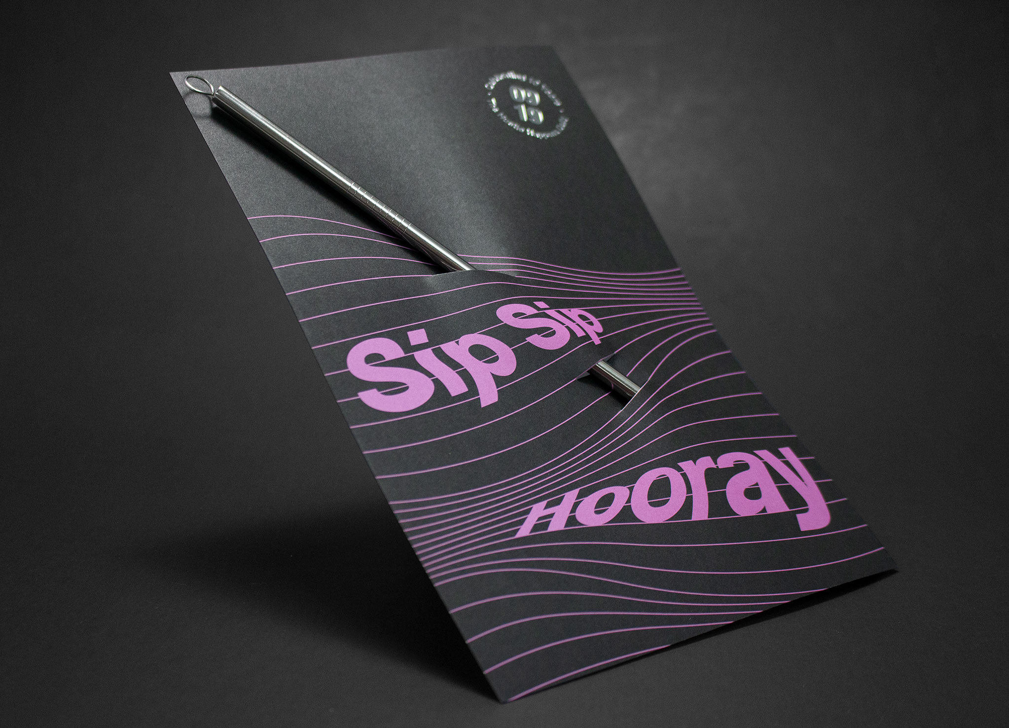
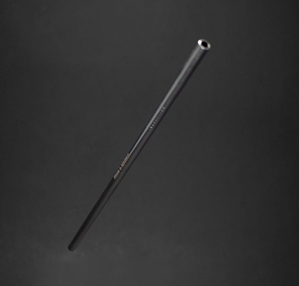
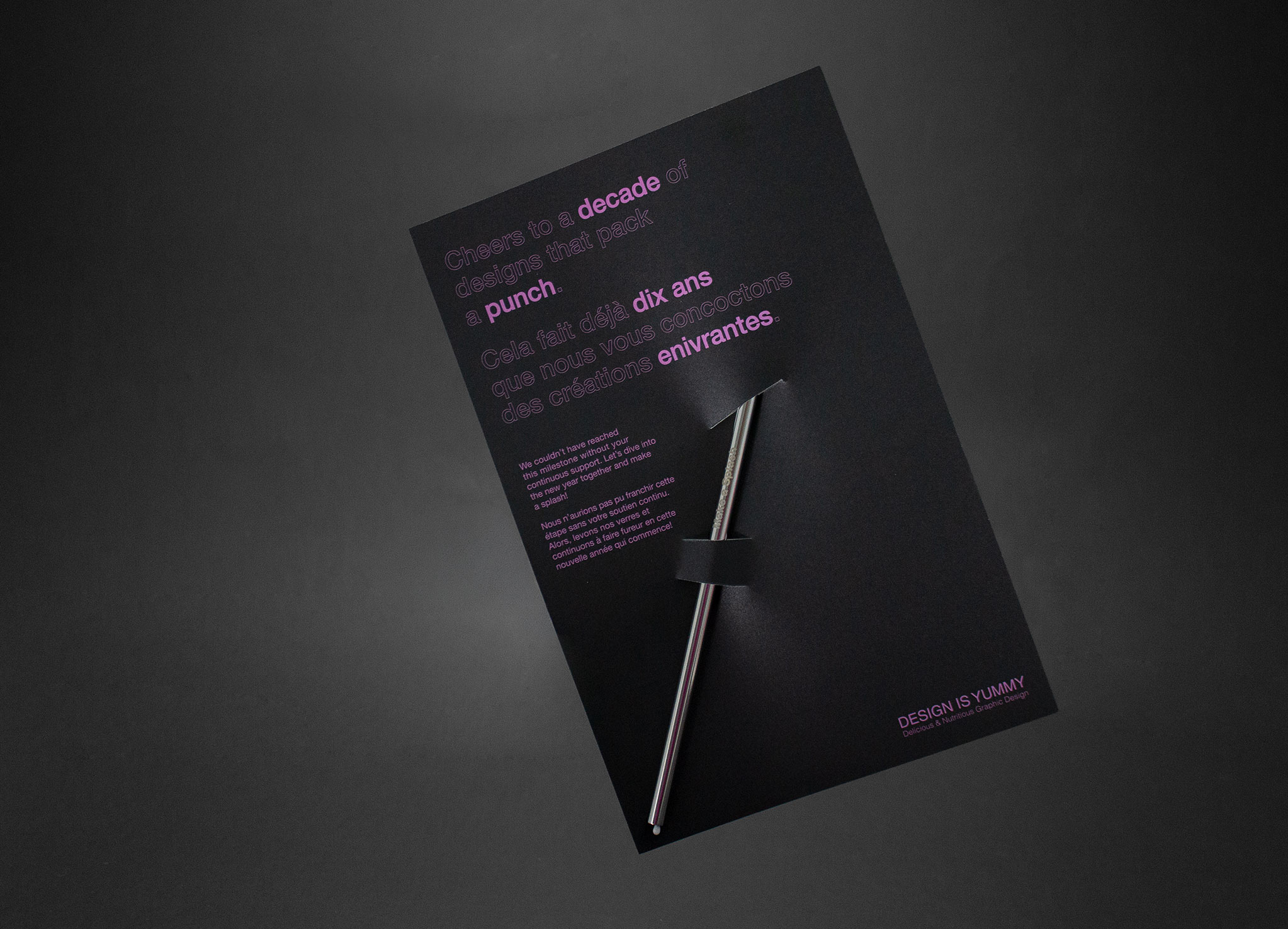
With 2019 marking our 10-year anniversary, we wanted to gift our clients something special.
Custom engraved with “Make a Splash”, these stainless-steel reusable straws served as a reminder to be bold and that together we can make an impact. We also went that extra mile by designing custom postage stamps and hand lettering each envelope (to add that personal touch we’re known for).
2018
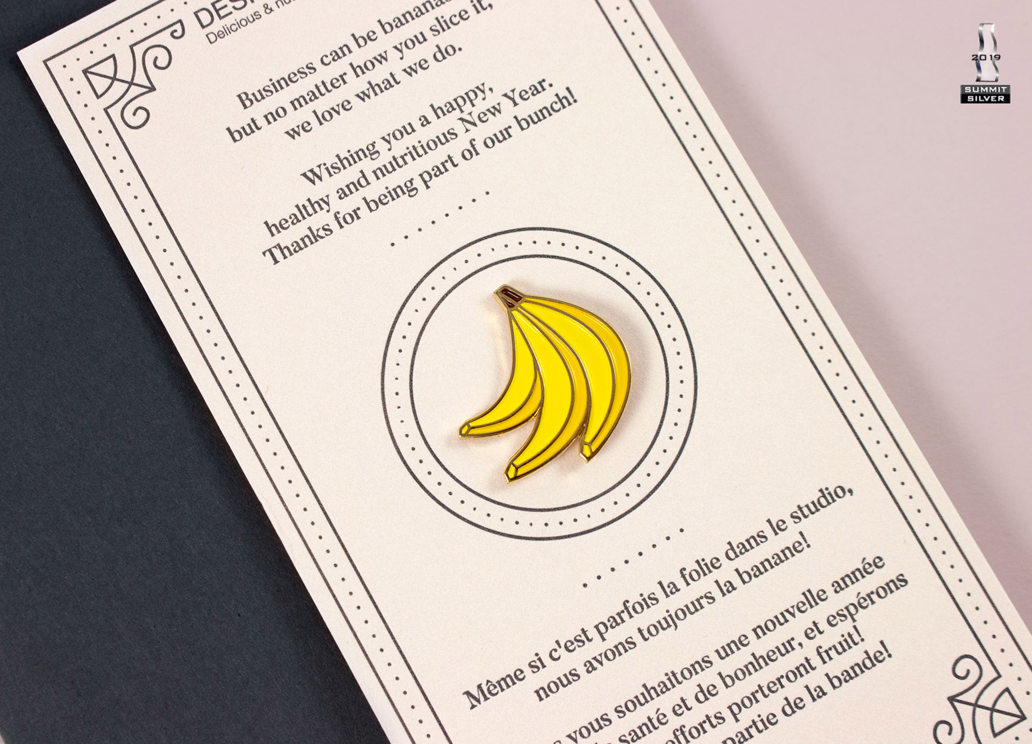
Business can be bananas, but no matter how you slice it, we love what we do.
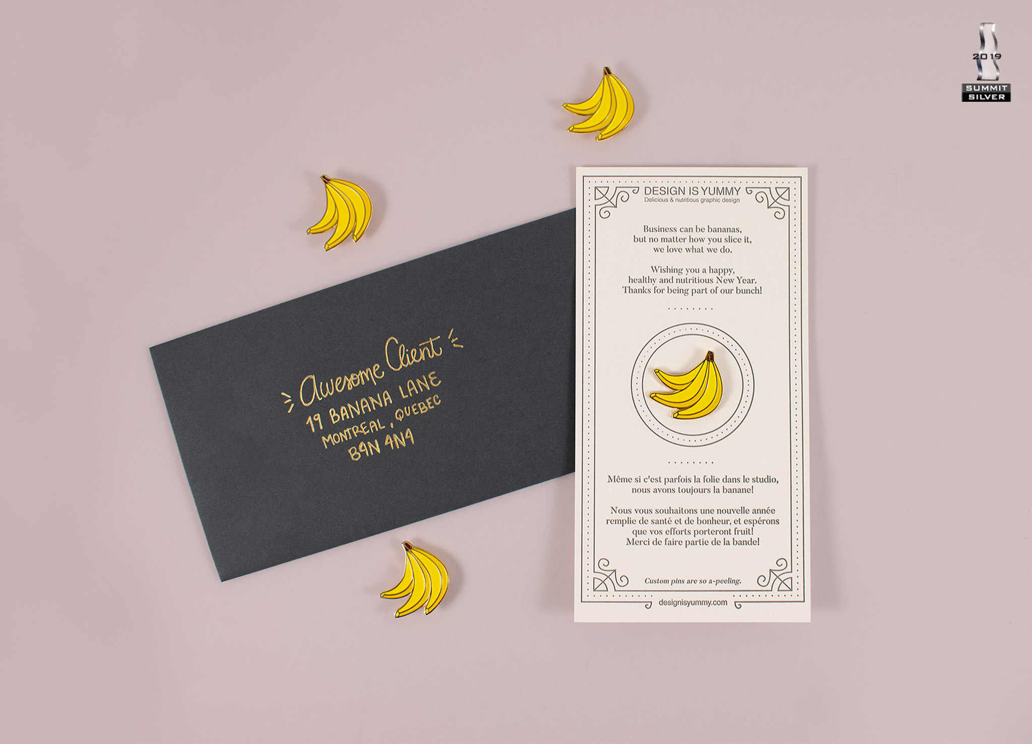
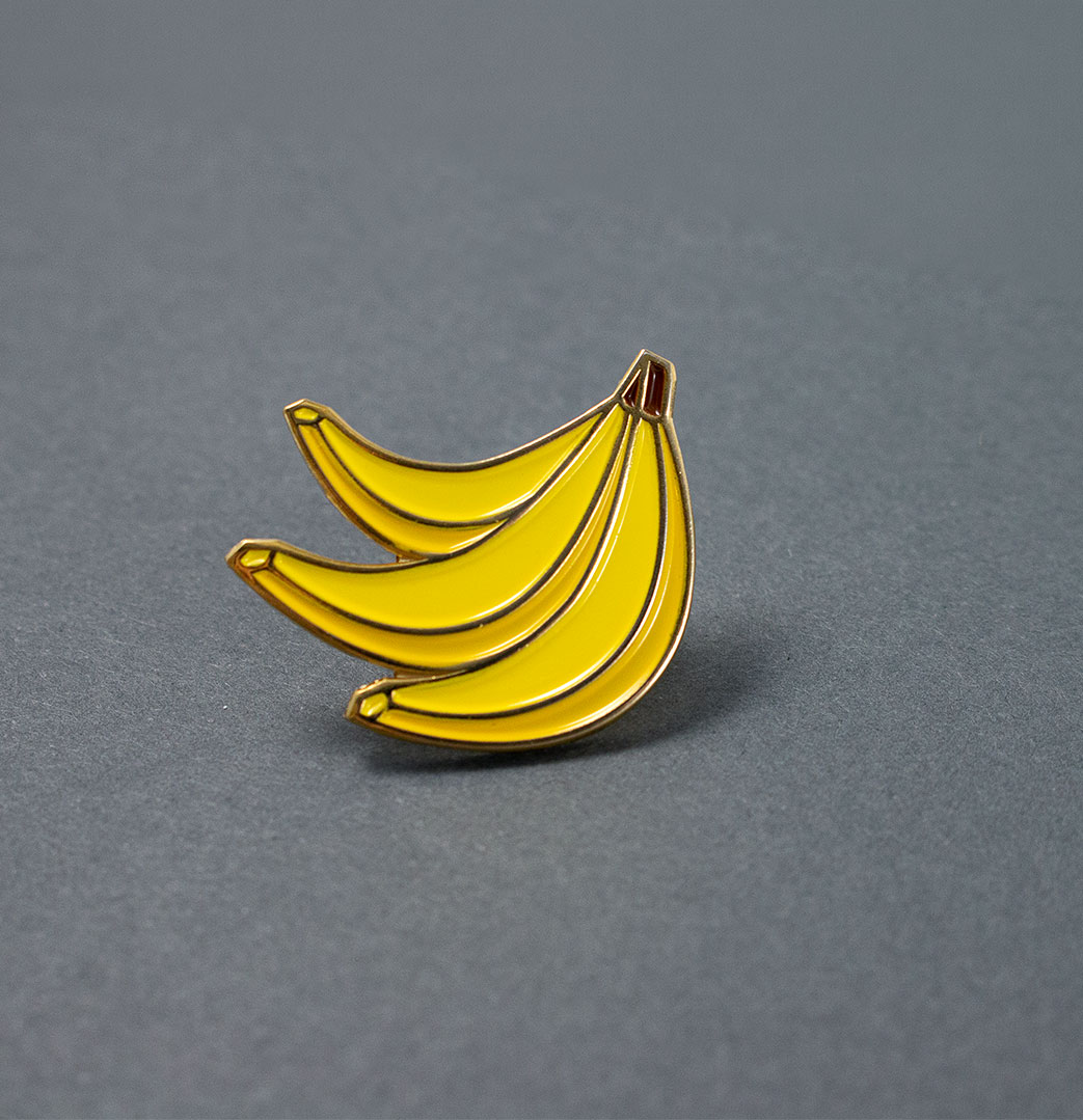
We’re totally bananas about design and our loyal customers.
For this holiday card, we sent a blush letterpress-printed card with a custom banana enamel pin, in a hand-lettered envelope. These cards serve as a reminder that we’re thankful to have them in our bunch. We love spotting our clients and supporters (still!) wearing them proudly.
Client
Design Is Yummy
industry
Arts & Culture
projeCt
Mentions
Silver Summit Award
Hungry for more?
Check out these related projects.
We make it our business to make yours look good.
Have a project in mind? Don’t be shy, say hi.
Never miss a piece of the action. Subscribe for your quarterly sugar rush.
Thoughtful design for brands with heart.
