Another year, another incredible season campaign launch at the Segal!
Earlier this week our team was invited to celebrate the launch of the Segal Centre of Performing Arts’ 2018-2019 season. The lobby was buzzing with the arts community, proud supporters, and some familiar faces!

The Segal Centre is always filled with lovely, creativity, and passionate creatives. We are grateful to these amazing clients and friends for allowing our team to help them achieve their artistic goals for the third year in a row.


As always, the launch was a total class act (pun intended if you know about their Class Act program). But seriously, we were exceptionally proud to show off our designs and see the community reactions to our work first-hand.

Don’t miss these incredible productions in the upcoming year.
Recently we took home a Bronze Summit Creative Award (SCA) for our Merry Everything Holiday Card.
The SCA awards small and mid-sized marketing firms around the world and is widely recognized for its honour and prestige. We are happy to take a spotlight in their 23rd celebration in the category of Invite/Holiday/Announcement – Industry Self-Promotion.

In the words of Mia Hamm “The person that said winning isn’t everything, never won anything.”
We’re proud and totally pumped to continue making award-winning designs! Go team!

Inspired by the flower of the Amaranth plant, this everlasting colour is similar to magenta but with a bit of a reddish tone. The word itself comes from the greek word Amarantus meaning “the never fading flower”. Sounds powerful. #E52B50

The term was originally a French vernacular name for the popular wild poppy flower. This colour is distinguished by being bright red and orange at the same time. So very naturally loud. #FF3800

More visible than white, this ivory colour has a light touch of yellow. Peaceful, warm, and visible! #FE6CC

This deep red is a dye commonly used on traditional Finnish wooden cottages and barns. The pigment was originated from copper mines in Falun, Sweden. Very brick like! #801818

This dull-orange colour is one of our favourites. It derives from the Latin Fulvus, which literally means “Yellow”. Looks like butterscotch, yum! #E48400

From the Latin Glaucous, meaning “bluish-grey or green”. It refers to that powder on the surface of leaves, stems, and fruits (the one you can rub off). We are big fans of this new neutral! #6082B6

This fire-like colour is as strong as a Japanese Emperor. It also happens to be one of our favourite childhood games! #FFC40C

That rich brown colour with copper undertones we all like on our furniture lately? That’s Wenge. Wenge is also known as “Espresso brown”, even though it looks a little more “Latte” to us. #645452

Named after an ancient city of Xanadu in China, this green-gray colour is inspired by the leaves of a plant known as the Philodendron. How restful! #738678
Get colour savvy by adding these terminologies to your colour repertoire.

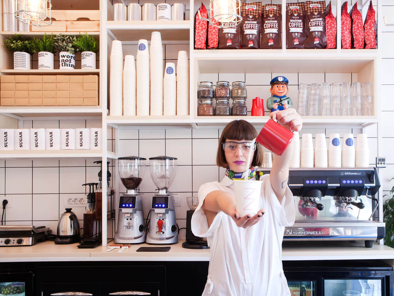
We love coffee, we love design, we love pink, and we love yellow… so naturally this coffee shop in Athens, Greece caught our eye.
Designed by studiomateriality, this coffee shop is unusual , eye-catching and oh so “instagrammable”.
The bright colour palette is accented with fish carpets, face lamps, and a funky laboratory feel.
Life is better at full weird speed.


This year’s IT thing to photograph and obsessively post on Instagram is Le Refuge, a pink “jungle” bed installation designed by artist Marc Ange at the Wallpaper* Handmade exhibition space during Milan Design Week.
Over 3,000 posts were uploaded on Instagram referring to it as “magical” and a “fairy tale”.
The artist Marc Ange calls it “a place where one finds comfort and peace. It is the projection of a childhood memory. Its large leaves form a shelter under the sun, away from reality, just like those of the imaginary jungle that grows in the room of a child who seeks escape.”
We can’t resist these giant pink metal leaves and the beautiful shadows it creates. We need one in our office.


We are very familiar with optical illusion drawings, but 3D ones? We’re mesmerized by Japanese mathematician Kokichi Sugihara’s solid 3 dimensional objects. He developed a computer program that interprets 2D line optical illusion drawings as 3D objects. The results are these amazing “impossible” structures that bring mind-bending to a different level. This year Kokichi Sugihara received second place in the annual illusion of the Year contest with his “Ambiguous cylinders”, which has been blowing the internet’s collective mind for quite a while. Check it out below:
The month of March has really brought us so many new project opportunities. We’re happy to show off another first – LEARNING ON THE JOB a fully illustrated and designed book by your friendly group of designers. The book showcases different life careers and the inspiring lessons we can learn from them. Every job has its own personalize illustration mixing simple and intricate designs in a sketch-like style vector art. The combination of visual representations and text helps create an aesthetically pleasing book which intensifies the reader’s reaction and inspires the ideas the client is trying to get across. The final artwork features black, turquoise, and marigold tones; colours that make the pages bright, energetic rich, and fun to look at. Take a peek at some of the pages created for this wonderful project:

The Challenge: Create a lasting impression and attract potential training clients Challenge accepted! To best reflect the energetic nature of the trainers at NBworkout, we designed this bold, dynamic business card. When it comes to creating an effective print design, it’s about more than how it looks on the screen. Paper and finishes are equally important when it comes to crafting quality, thought-out designs. We felt the cards should be physically strong while remaining flexible so that they would not come across as stiff. To achieve this balance between tough and bending we used a wicked 32 pt matt laminated paper. The green colour edging undeniably adds to the vibrancy of the cards as well. The fluid blue to green gradient, bright watermarked logo and perfectly matching green sides help to create the striking effect. Confident and instantly eye-catching, these business cards are exactly the sleek calling card the client was after. Another happy client and some very happy designers too. Win win!

Maggie, a Nigerian dwarf goat at Oakland Zoo, recently had her hooves dipped in paint in the name of art and a good cause. The zoo will be auctioning off original abstract paintings done by their animals at their Animal Art Show in a clever effort to raise money for conservation partners. Last year, Oakland Zoo auctioned off twelve paintings and raised an impressive sum of nearly $10,000. All paintings sessions were directed by gentle zoo keepers using only positive reinforcement (treats!) and none of the animals were forced to participate. Thirty-two of the works will be auctioned on eBay starting today until September 20th.

By Ting Ting the sun bear

Jenny, the sulfur-crested cockatoo

Squirrel monkeys, Pythagoras and Peru