When a company has spent over 30 years building trust, a logo carries more than just visual recognition; it holds history. That was the case for Eastern Transmission, a respected name in the Canadian automotive industry that has grown from a small transmission shop into a highly efficient operation known for exceptional quality and service.
When they approached us, their goal wasn’t reinvention. It was refinement.
![]()
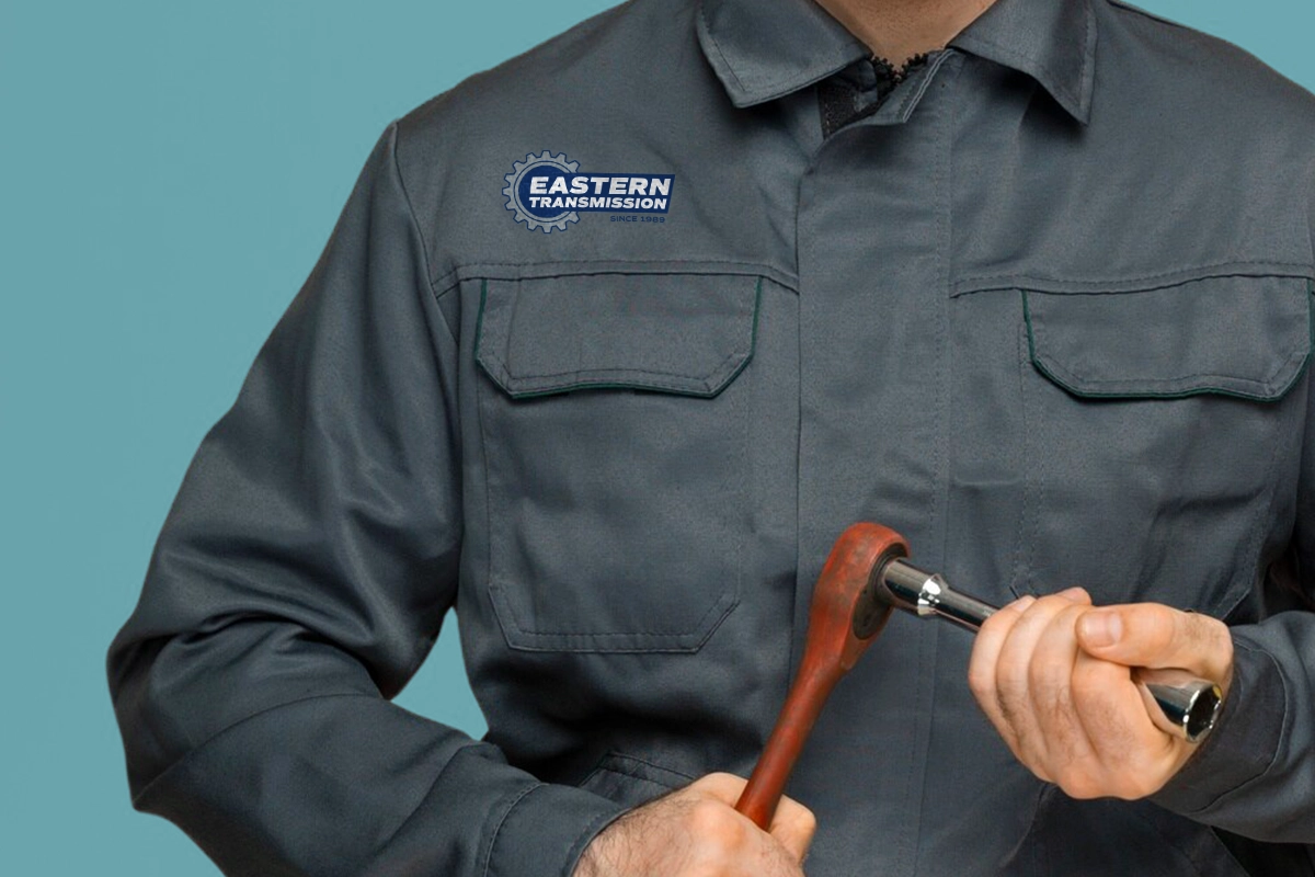
The existing logo already held equity with their customers, so our role was to make it work better for them without losing the familiarity people have come to recognize. We cleaned up the original mark, refining its forms and proportions to create a sharper, more contemporary feel. From there, we developed circular and simplified versions of the logo to ensure it could work across a wider range of digital and print applications.
We also expanded the brand colour palette to increase accessibility and introduced clean, functional typefaces to support consistent communication across every touchpoint.
![]()
![]()
One important constraint shaped the process; the rollout needed to be gradual. Eastern Transmission wanted to avoid unnecessary waste by continuing to use existing materials that feature the original logo. That meant the new identity had to transition seamlessly alongside the old one. Rather than a dramatic shift, the update focused on clarity, versatility, and longevity.
The result is a brand identity that feels more modern while staying true to the reputation Eastern Transmission has built over decades. Sometimes the most effective design move isn’t starting over, but evolving what is already there to work better.