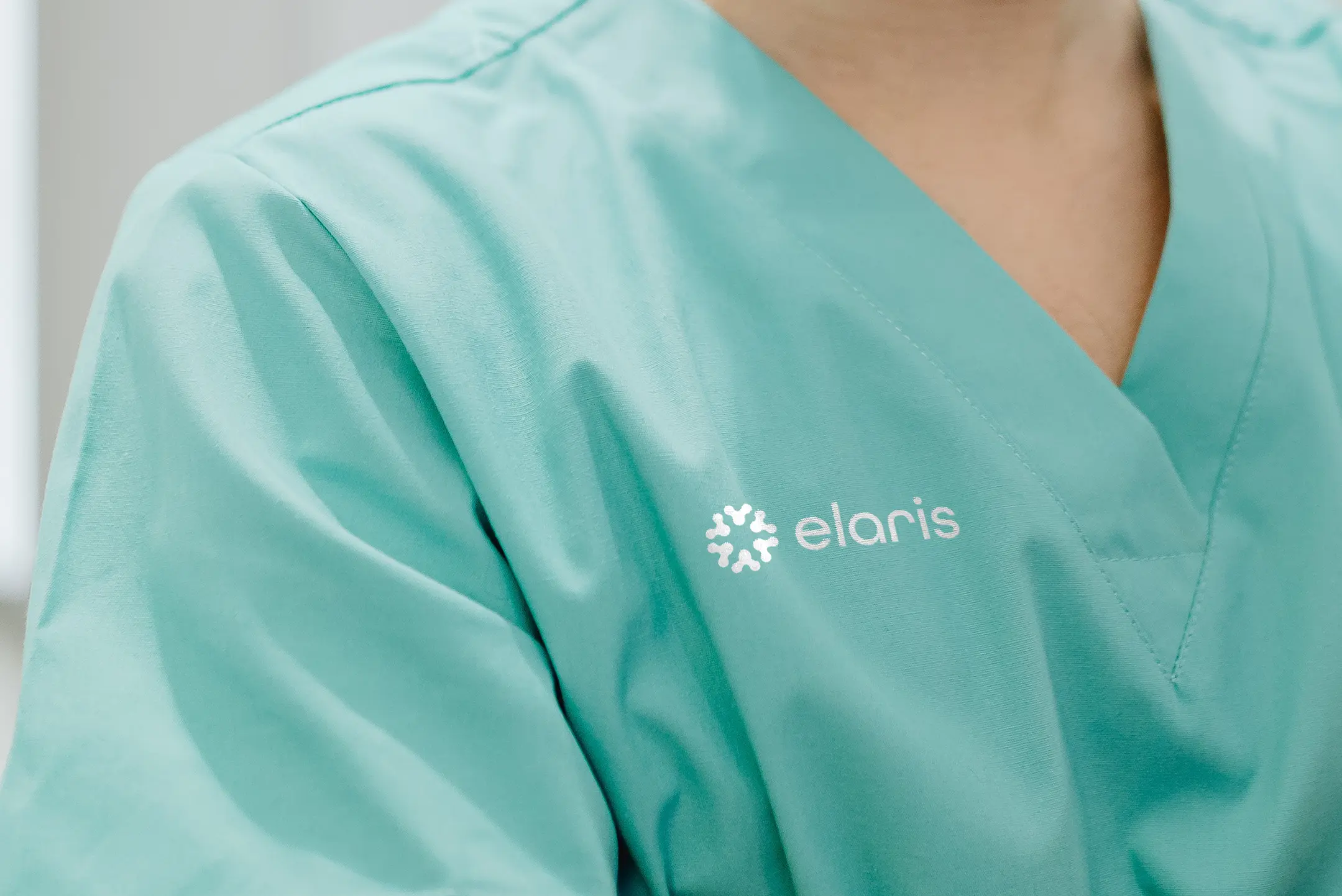
Elaris is dedicated to developing next-generation vaccine solutions. Driven by research, collaboration, and discovery, they needed a visual identity that reflected scientific rigour without feeling cold or clinical. The brand had to communicate credibility and trust while capturing the optimism and forward momentum that define breakthrough research.
At the heart of that challenge was one key question: How do you distill complex science into a single, meaningful mark?
We began by looking at the foundational forms within immunology itself. One shape stood out immediately: the Y form of an antibody. The antibody is both literal and symbolic. It represents protection, precision, and the essential building blocks of immunity. It is instantly recognizable within the scientific community yet visually simple enough to evolve into a strong graphic device.
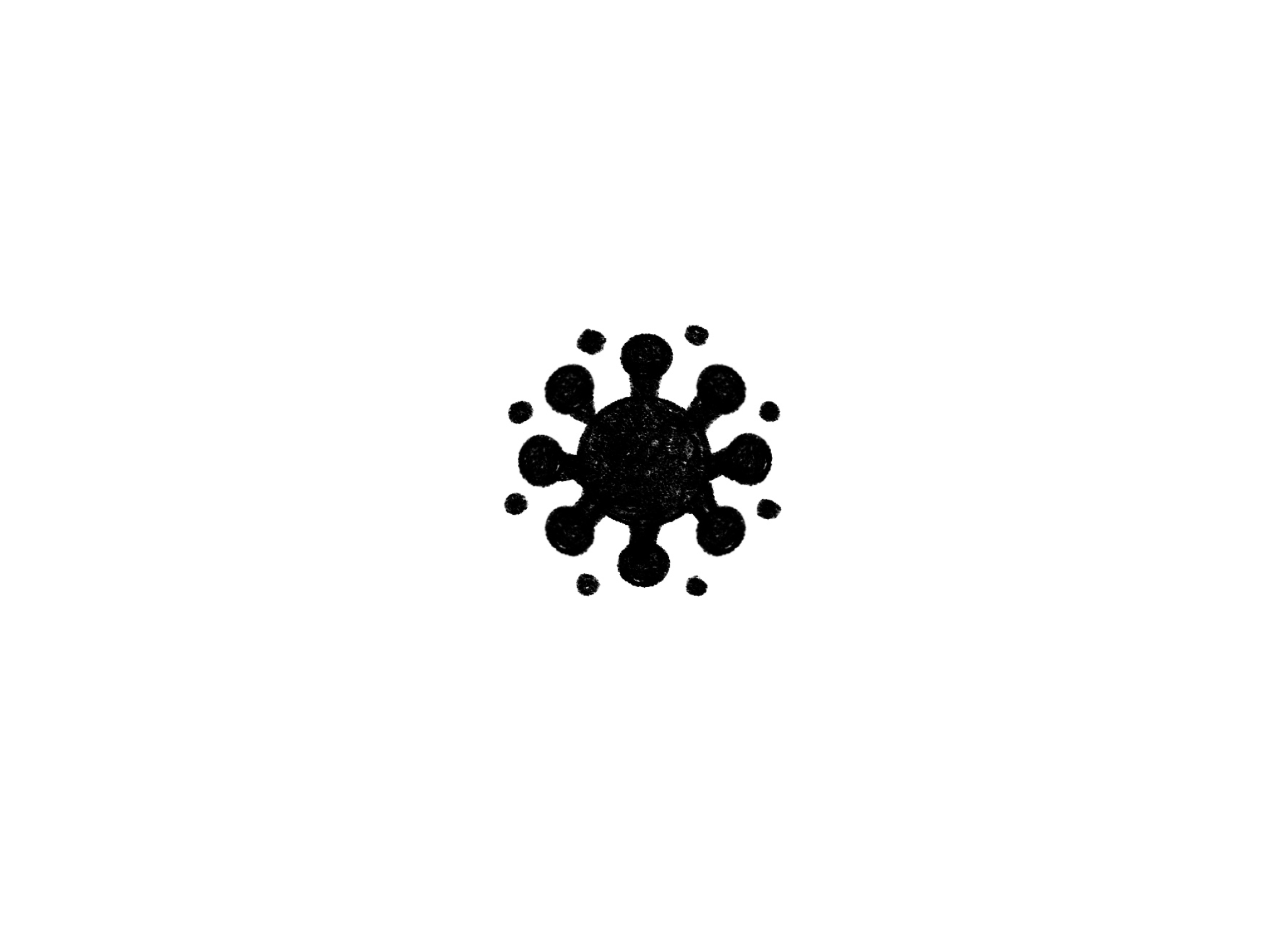
A single antibody form felt powerful, but we knew that at its core Elaris is about collaboration. Breakthrough science does not happen in isolation. By repeating the Y shape circularly, the symbol evolved from a literal scientific reference into a broader expression of unity and shared progress. The composition reinforces continuity and momentum. It suggests cycles of research, testing, refinement, and discovery. The geometry is deliberate and balanced. Every angle and spacing decision was made to ensure the mark felt precise and credible. At the same time, the radial movement introduces a sense of energy. The symbol feels alive rather than static.
We anchored the brand in grounded blues to signal trust, stability, and scientific credibility. Blue also carries a long-standing association with research, healthcare, and reliability. It provides the seriousness that a vaccine development company requires. To balance that foundation, we introduced vibrant accent tones. These inject energy into the brand and represent innovation, momentum, and the optimism inherent in discovery.
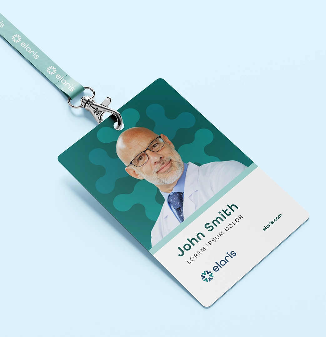
The final brand symbol for Elaris works as a standalone mark, a repeating pattern, a framing device, and a storytelling tool across applications. Most importantly, it reflects how Elaris operates: precise, collaborative, and constantly moving forward. In the end, the process of designing the symbol mirrored the research process itself. Start with fundamentals. Test ideas. Refine the structure. Build something strong enough to support what comes next.